![]()
![]()
![]()
![]()
![]()
![]()
![]()
![]()
![]() Home > Internet & Media
Home > Internet & Media
Google News redesigned with a cleaner look
![]() June 28th, 2017 | 07:18 AM |
June 28th, 2017 | 07:18 AM | ![]() 2406 views
2406 views
ENGADGET
It has adopted a card format and gotten rid of anything that adds clutter.
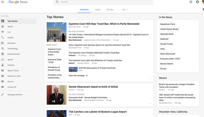
If it's been a while since you've visited Google News, now may be the best time to take a peek. Google has given its News website's looks a thorough cleanup, retaining key elements and giving you more control while getting rid of anything that adds clutter. In short, it doesn't look like a search results page anymore. Gone are the blue links and the article snippets. It has adopted a card format that groups related stories together and has relevant tags you can click to delve deeper into particular topics. Even better, clicking a link opens a new tab, so you don't have to click back to explore the other stories.
The design's best new feature lies outside the cards, though: you can now customize the menu on the left-hand side of the page. All you need to do is click "Manage Sections" to add new a new search term and to give that new entry the appropriate title. That could make following any unusual topic you may be interested in a lot easier.
Source:
courtesy of ENGADGET
by Mariella Moon, @mariella_moon
If you have any stories or news that you would like to share with the global online community, please feel free to share it with us by contacting us directly at [email protected]
Today |
52090 |
Since March 25, 2016
![]()
![]()
![]()
![]()
![]()
© Copyright 1999 - 2024 | Brunei's No. 1 News Website. All Rights Reserved.
1250-A, Jalan Tanjung Bunut,Jalan Tutong BF2920, Bandar Seri Begawan, Negara Brunei Darussalam